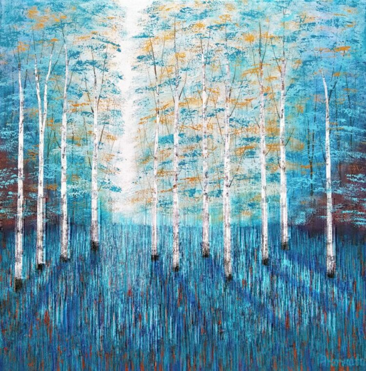
Woodland Serenity by Amanda Horvath
Step into the serene world of Amanda Horvath’s acrylic painting “Woodland Serenity”. This captivating artwork transports you to a peaceful woodland scene in the Peak District. Amanda’s connection to nature shines through in this piece, capturing the woodlands essence.
In “Woodland Serenity,” you’ll find yourself immersed in a lush forest. Towering trees stretch high, casting shadows on the woodland floor. A distant glimmer of light adds a touch of mystery and hope to the scene. Her choice of the colour turquoise blue, a vibrant and optimistic hue, takes centre stage. Complementing the turquoise are warm copper and gold tones, creating a striking composition.
This original painting is created with high-quality acrylic paints on deep-edge canvas. The creative process begins with her careful observation and documentation of her natural surroundings, serving as the foundation for her work. She employs various techniques, including brushwork and impasto methods with a palette knife. Inspired by the techniques of impressionists and old masters’ styles.
“Woodland Serenity” blurs the lines between abstraction and realism, resulting in a contemporary artwork that speaks to the soul. The painting extends seamlessly around the canvas edges, therefore eliminating the need for a frame.
VIEW ALL ARTWORKS BY AMANDA HORVATH
What inspired you to create “Woodland Serenity,” and why did you choose this particular woodland scene as your subject?
I think trees are so important in terms of the environment forming a natural habitat for birds and wildlife. Also they are a wonderful retreat from the stresses of everyday life. There are some lovely birch woods close to the studio that form the basis for many of my paintings. So I visit this place in all seasons and weathers and I’m always inspired by the textures and colours of the trees; The sights and sounds of nature and the movement of breezes rustling leaves.
The colour palette in this piece is striking, with turquoise, copper, and gold tones. Could you share more about your choice of these colours’ and the emotions or messages you aimed to convey?
My paintings are always rooted in some reality and my visual research forms the beginning structure for a painting. Then imagination, memory and an emotional instinct take over the creative process. I try to convey a peaceful quality in my paintings and I’m particularly drawn to working with turquoise and blue. Because traditionally they are healing colours with a connection to the spiritual world. On a more earthy level I’m especially fascinated with copper and how after a time it becomes that lovely turquoise. Copper and gold seem to naturally compliment turquoise and blue. I think the colours are beautiful and a lovely thing to bring into one’s home.
Your creative process involves a combination of observation and intuitive techniques. Can you walk us through the steps you took from initially observing the woodland to the final brushstroke?
I begin with walking outdoors and I’ll usually see something that interests me like a particular composition. The light falling a certain way or some beautiful colours in the bark or mosses and lichens growing nearby. So observation of the place is important and making notes in my sketchbook. I also have many drawings to refer to. I will take photographs, not to copy but as a way to take my mind back to the place when I’m in the studio, as so much of it is about the feelings of being in the forest. From these beginnings I work intuitively, painting some dark layers with a brush and then impasto techniques in layers using a palette knife. I’m influenced by the optical mixing techniques employed by the impressionists. They also painted with many marks to build a visual image that the eye mixes when viewed from a distance.
The play of light and shadow in “Woodland Serenity” is quite captivating. How did you go about achieving these in your painting?
I usually work from dark to light and build the textures with gradually, increasing lighter layers of paint so that as the painting progresses. Dappled light and dark areas begin to form from the underpainting. Towards the end of the process I can make a decision whether or not to add any darker tones to accentuate the shadows.
VIEW ALL ARTWORKS BY AMANDA HORVATH