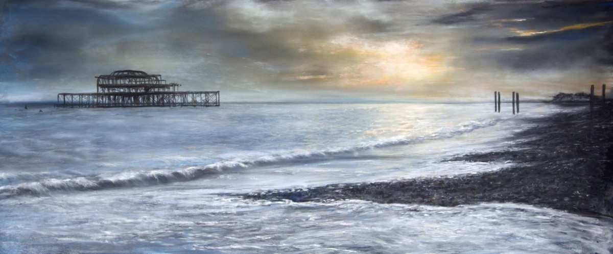
Sunset Over Brighton Pier is a beautiful and serene piece of art created by Alexandra Lavizzari. The artwork captures the calmness and tranquillity of a sunset over the iconic Brighton Pier. The painting is created using soft pastel on pastel paper, which adds to the overall dreamy effect of the artwork.
The painting depicts a stormy sky with a break where the sun shines through. The golden light from the setting sun reflects on the water, creating a stunning golden hue. The waves gently wash up onto the darkening beach, adding to the peaceful and serene atmosphere of the artwork.
The Brighton Pier is silhouetted in the distance, and the painting’s long narrow format lends itself well to the subject, giving the impression of a sweeping view across the sea. The colours used in the painting, blue-grey tones of sky and sea, match perfectly with the bespoke wooden frame’s light colour, creating a beautiful and harmonious composition.
Alexandra has painted Brighton Pier before, and it’s evident that she has a special connection with the subject. The painting is not only a stunning depiction of the sunset over the pier but also a testament to the artist’s love for the area. The artwork is atmospheric, tranquil, and evokes a sense of peace and calmness, making it a perfect addition to any art lover’s collection.
In conclusion, Sunset Over Brighton Pier is a beautiful and serene artwork that captures the essence of a calm and peaceful sunset over the iconic Brighton Pier. The use of soft pastels on pastel paper creates a dreamy effect that adds to the overall tranquillity of the artwork. The painting is a must-see for anyone who loves art, seascape, and Brighton.
QUESTIONS TO THE ARTIST
What inspired you to create “Sunset Over Brighton Pier,” and how did you decide on the composition and colours used in the painting?
There is something poignant about derelict piers; In the case of the old Brighton Pier I am keen to show its beauty and how harmoniously it is embedded in its natural environment between sea and sky. A sunset seemed to me the best symbol to characterise this wonderful but very frail building as it bravely withstands the passing of time.
For the composition I thought it was important to show the scale and the distance of the pier to the mainland, which can only really be achieved if you include the beach as a foreground as a point of reference. Often I paint dark moody skies, because I find them more interesting than clear blue skies. Under the clouds the sea – or land – display a bigger variety of hues, which makes it more of a challenge for the painter to get it right. And also, pastel being such a vibrant medium, it is a joy to be able to use its full potential in an atmospheric artwork.
Could you describe your creative process when working with soft pastels on pastel paper, and what techniques did you use to achieve the dreamy effect in the painting?
Pastel paper must have a tangible ‘tooth’ to retain the pigments applied on it. Painting with pastels is messy, the pastel sticks are soft and some, which are specially soft, crumble easily and then spread dust on the paper, so one must be careful to use the appropriate type of pastel for each element in the painting. Being left handed I normally start on the right upper corner and work my way to the left lower corner. In seascapes like ‘Brighton Pier’, I start with the sky, applying very soft pastel which I then push into the paper with my fingers. I create lighter and darker areas and blend them, again with my fingers, to smoothen the transitions, and it is this smoothness which creates the dreamy feeling I want to achieve. Some artists like to show pastel strokes on the paper; I usually prefer not to. On the other hand, a painting which is done only with blending can easily look too dreamy, lacking sharp edges as a contrast. Brighton Pier with its definite shapes is therefore a perfect contrast against the sea and sky; I used a black pastel pencil for it and there is also some pencil work with the pebbles. For most of the painting, though, I used my fingers.
Why do you keep returning to Brighton Pier as a subject for your art, and what do you find so special about this location?
Together with the old Birnbeck Pier in Weston-super-Mare – which I have also painted in the past – Brighton Pier is my favourite disused Pier I have seen so far. Somehow I keep coming back to it like an old friend, always hoping that it will not be left to crumble. I am fascinated by the contrast of Brighton’s modern pier which is colourful, full of visitors and shops and on the other hand, in an unreachable distance, the old pier, all black, which has known better days and looks a bit like an abandoned skeleton. Standing on Brighton beach and looking at both piers always gives me a very strong feeling of the transience of human existence, which, I guess, is a good thing to be reminded of from time to time.
Can you share any interesting or unexpected challenges you faced when creating this piece, and how did you overcome them?
There are various technical challenges in a painting like Brighton Pier. Since it is a sunset scene, I wanted to achieve as much luminosity as possible in the sun’s area; that meant calibrating the darkness of the clouds around it very carefully without smudging. I used a dark grey paper to start with, so any dark pastel in that light area would have dimmed it considerably. Secondly I had to be careful with painting the pier on the three or four paint layers of the sky. I had to apply strong and decisive lines and not make any mistakes, because any correction would have resulted in blurring the sharpness of these lines. And last but not least: painting the sea is always a challenge. For me, painting shorelines is less of a difficulty than painting bigger areas of open sea and making sure the sea has depth and movement as well as the right intensity of light reflection on its surface.