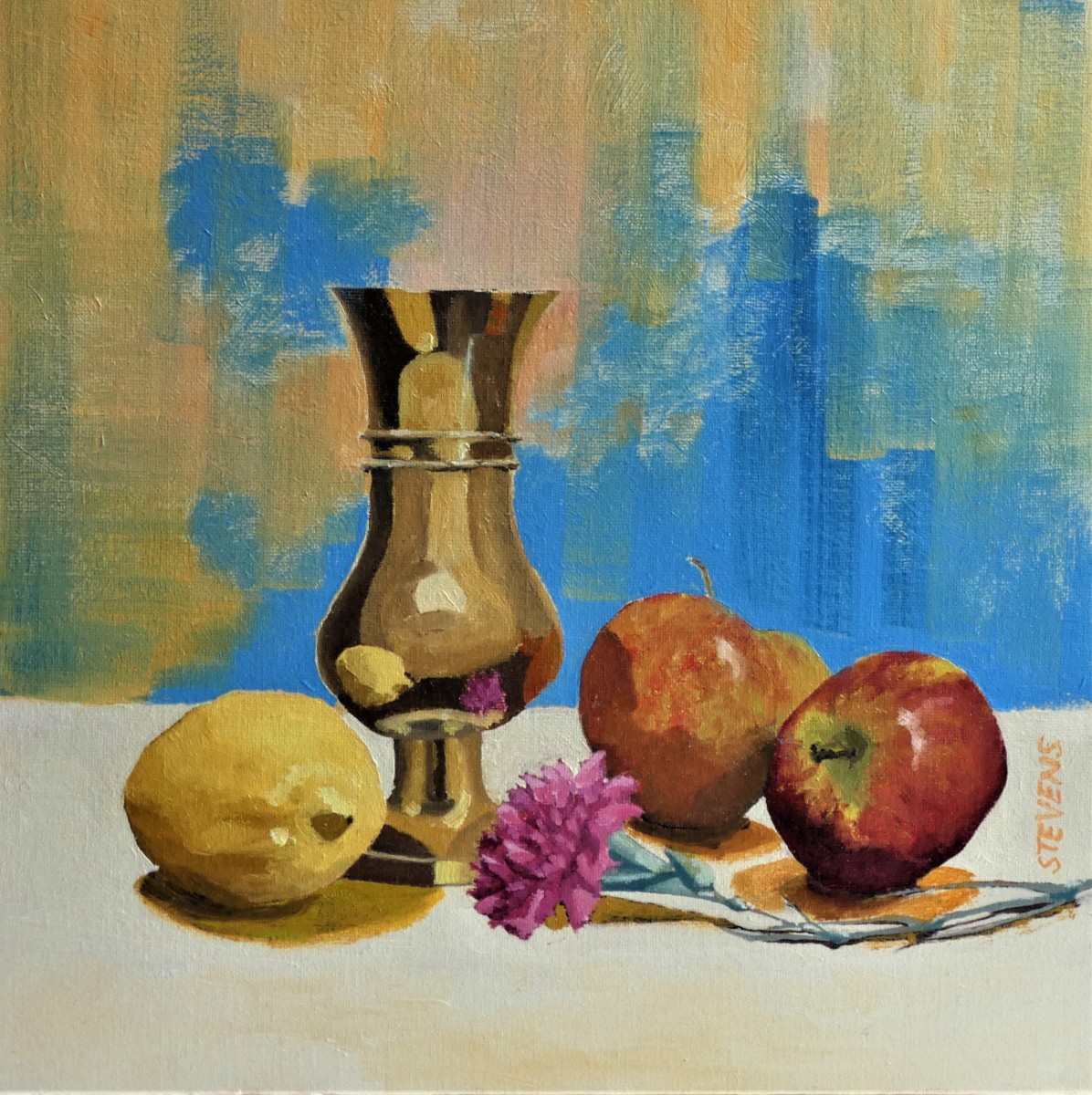
In his painting Brass Vase & Fruit, Andrew Stevens captures still life beautifully. Created using oil on board, this painting is reminiscent of modernism art. The use of strong contrasts, composition, and varying the level of details found within the piece makes it a powerful piece of art.
Subject wise, the still life has a baroque feel. This is primarily because of the inclusion of the goblet, something which artist such as Carla Peters or Willem Kalf would find appropriate. But the overall aesthetics of the piece lean to the modernism movement, specifically to the painting style of Cezanne. If the viewer were to look at The basket of Applesby Cezanne, then that person would immediately see the similarities. First, the apple details are very similar. While there is a level of detail to the apples, there is also an absence of detail. The eye bounces back and forth between the various fruits, filling in any gaps of missing details.
Andrew Stevens has composed the piece nicely, following a circular path for the eye. Starting out, the eye focuses on the vase. The eye then travels down the vase to either the apple or the lemon. Due to the flower placement, the eye then travels across the board to the other side. The fruit is viewed and the viewer is taken back to the base. The painting is not limited to just the circular composition, however. The background of blue and yellow helps to guide the eye from the top to the bottom of the painting.
In terms of the overall level of detail and the arrangement of the piece for the viewer, one will find that the modernism influence is strong. First, the painting is cut with a strong horizontal line. This line forces the eye to see the vase as the primary subject. Then, the use of highlights and shadow create a strong contrast between the positive and negative spaces. Note the reflection on the vase and the shadow under the apples and the flower. These are painted with hard edges, following the style of the modernism era. Additionally, the highlights one the vase and the apple are painted the same way, resulting in a three-dimensional feel.
Influenced by Scottish Colourist and feeling much like a still life from Cezanne, Andrew Stevens still life captures his subject matter beautifully. To fully understand the painting, we asked the artist to elaborate on the following points.
Typically, your artwork leans to landscapes. What influenced you to paint a still life and do you think that you will paint more in the future?
For me painting a still life is a good exercise in observation and brushwork. It’s something I tend to do on the odd winter days when the weather keeps me in the studio. I enjoy getting the values as accurate as possible and try to keep the composition fairly simple. Quite often I’ll produce a still life painting and leave it to one side for months or even years before looking at it afresh and deciding what’s good and what isn’t. I’ll then try to correct my errors or weaknesses in the piece. I don’t think any artist would say they are ever happy with their work but there’s always a point when you say it’s as good as it gets, so leave it alone.
Although I’ve been a regular visitor to Scotland, it wasn’t until I moved here a few years ago that I discovered both the Glasgow Boys and the Scottish Colourists at Kelvingrove Art Gallery & Museum in Glasgow. Their work is, for me, inspirational and has been a big influence particularly in the use of colour but also in the way that artists such as Peploe, Cadell and Hunter could create atmosphere, freshness and movement using bold brushwork and little detail.
How has living in Scotland influenced this painting? Are there other influences which the viewer should know about?
Obviously Scotland has the scenery that shouts out to be painted but quite often the vastness doesn’t translate into an interesting painting. This can be quite frustrating when you want to convey the enormity of what’s in front of you but it simply doesn’t grab your attention once you’ve painted it. So, one of the things I’ve learnt from painting Scottish landscapes is to concentrate on a smaller scale and not get caught up in the detail but paint more freely.
How do you think your journey as an artist has played into the creation of this piece?
I think the willingness to use brighter, bolder colour is shown in Brass Vase & Fruit. At one time I’d probably have used darker background colours to project the subject matter. I’m now much happier using colour contrasts to make a painting more vibrant and interesting.
Brass Vase & Fruit is oil on painted board. It measures 30c m by 30 cm.