Trends are ever changing, and not only in the fashion industry. Popular colours in the world of interiors also vary from season to season, and as we enter the New Year a whole host of newly defined palettes are set to take over the walls in our homes, hotels, restaurants and more. Dulux, a leading provider of premium paint and finishes has released its offering of colour trends for 2017. Here we highlight our favourite styles, showing you the perfect pieces of original art to complement each one, ensuring your walls stay stylish this year.
Trend 1 – New Romanticism
This trend reminds us that we are connected to nature and have a duty to the world – to take care of it. As a result, the boundaries between indoors and outdoors are blurred using rich greens, cool greys and teal tones to describe this feeling.
Reflect by Steven Coughlin fits this trend in a number of ways. As well as suiting the colour palette, its natural subject of a leaf and water droplet, as well as its urge to ‘reflect’ suits this mindful interior style. Yet for something more organic, Dappled Walk by Alison Chaplin offers a calming forest scene to adorn any wall with greenery.

‘Reflect’ – view here.

‘Dappled Walk’ – view here.
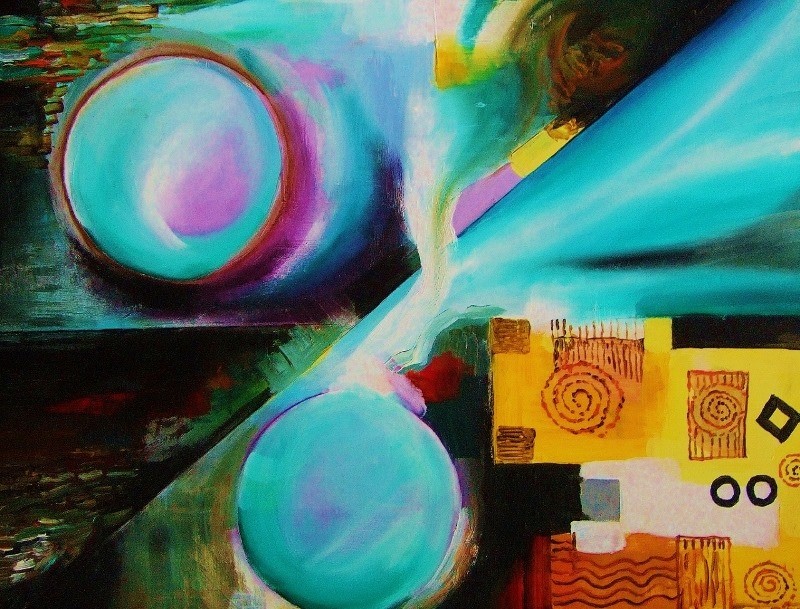
Trend 2 – Shared Individualism
If 2016 has been the year that the freelancer and the co-working space took off simultaneously, then 2017 will only see this rise further. Not only are working spaces being shared, but more and more we are co-inhabiting with others in our home environments. Shared Individualism uses bold colours to create a fun environment to be enjoyed by many. Bright yellows and oranges are paired with greys to create a truly beautiful palette.
Close to the Moon by Van Renselar could certainly create a talking point, helping to bring together individuals in these shared spaces, while the tones used in this digital artwork are seen in this trend’s colour selection.

‘Close to the Moon’ – view here.
Trend 3 – Considered Luxury
In 2017 luxury is defined by space, enabling you to focus on memories rather than be bogged down by clutter. Cool, neutral tones with a twist create this look, making a room feel airy and effortless.
Something equally as subtle is needed to place on these walls, and Way to Spring 2 by Mireia Izquierdo provides the perfect piece. With no tangible subject, only blurred marks and blends of colour are used to form this beautiful canvas.

‘Way to Spring 2’ – view here.
Although we have used the fantastic colour predictions from Dulux to inform this post, it should be noted that we have no official partnership or collaborative agreement with the brand.
If you are updating your home ready for 2017, browse the full range of colour trends and use our search filters to find our paintings for sale that compliment it, here at Art2Arts.